C+S design Metrogorodok, Moscow, Russia


Metrogorodok urban interior
C+S Architects, in collaboration with Citizenstudio, has won the Face of Renovation international competition organized by the government of Moscow, Russia for the development of the architectural, spatial and stylistic concepts of the facades of public spaces residences as part of the renovation program of the real estate assets. The overall plan includes 52 lots.
C+S Architects and Citizenstudio will design the Metrogorodok area (lot no. 13), for a total building area of 1,366,000.79 m2.
The main objectives of the design are:
- overcome the current repetition of the facades to generate a new identity for the area;
-highlight the quality of the context and reinfors=ce the identity of the citizens;
- identify points of aggregation and public spaces capable of becoming recognizable cornerstones;
-create a hierarchy of public and semi-public spaces, to broaden the variability of urban life scenarios and create a livable and sustainable city.
"As Italian architects, we are used to looking at our cities as 'urban interiors'. For us the squares are not voids, but rather ‘urban interiors’ in continuity with the facades of the buildings or the greenery that overlook them. We exported this simple and beautiful concept to Moscow and, by studying the evolution of the housing tipology of the city of Moscow, with the help of our Russian friends of Citizenstudio, we have combined the materiality and plasticity of the facades with the design of the public space. The project almost magically creates a grid of colors and materiality that determines the new identity for the citizens of Metrogorodok with the ambition that they can recognize it and call it "home."- state Cappai and segantini, C+S.
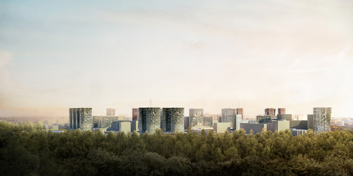
There are two main elements, which constitute the backbone of the Metrogorodok site: the Losiny Ostro National Park (the largest green area in Moscow) on the northern border and the existing urban axis of Otkrytoye Shosse Boulevard.
The materiality, the plasticity of the facades, the use of color, as well as the nature of the pavement of public squares and community spaces give shape to a system of spatial coordinates where, each type of space is assigned its own color - green for the spaces falling within the gravity zone of the Bosco, red for spaces falling within the gravity zone the Boulevard and its urban character.
The transition spaces between the two poles, are intermediate spaces: they have a more neutral shade - white and light gray, which characterizes the living environment in the heart of the neighborhood without major influences from either of the two main gravity zones, but are instead enriched with colorful paved play areas and common grounds.
Facades
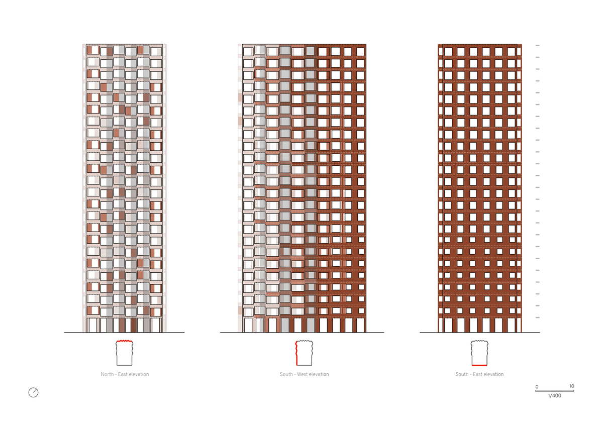
While towards the boulevard the towers have a calm nature, the facades of the towers overlooking the wood are characterized by a more generous plasticity that increases as one moves towards the upper floors, also producing an increase in the floor area as well as an increase the percentage of forest views on the upper floors and revealing a new class of the most prestigious apartments.
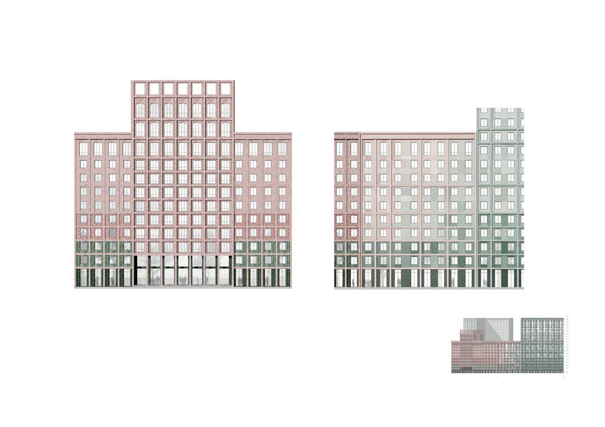
The image of future buildings is inextricably linked to the context in the area of influence in which each specific typology falls and belongs. The variability and variety of development scenarios is achieved through the use of two main tools: the plasticity of the facade and the gradation of the color tone, linked to its materiality.
The palette of colour shades of the facades directly depends on the area of influence of which magnet falls this or that part of the building.
The facades overlooking the Boulevard Otkrytoye are made in a deliberately homogeneous mass of colours: a red terracotta shade, which is a reaction to the public nature of the space and which is designed in continuity with the external flooring.
The lateral facades of the towers, turning towards the quiet internal park of the district, change their tonality towards lighter tones, underlining a character that becomes more and more private.
The chromatic palette of the facades of the urban blocks is also formed based on the reaction to the surrounding context and to those areas with which the facade comes into direct contact and interacts. The more intense emerald green marks the influence of the wood, reaching its peak towards the corners of the building. The colour gradient creates a smooth transition from the most saturated colour spots to an achromatic shade.
The link between the public space on the ground and the building is expressed through the different character of materiality, which determines the hierarchy of spaces.
The dense mineral pavement of the city boulevard along Otkrytoye boulevard is eroded by grass grafting as we approach the inner district park. On the avenue side, the pavement has a colour similar to the facades - terracotta red, which softly turns to light gray on the side of the city park, to reinforce the idea that the facades and soil give rise to a precious 'urban interior'.
The paving of the courtyards is coloured, welcoming the play and sports areas of children / teenagers with the inclusion of islands of vegetation.
Credits
Credits
Architecture design
C+S Architects, Carlo Cappai, Maria Alessandra Segantini
Project Managers C+S: Alice Cecchini, Roman Joliy
Team C+S: Alice Cecchini, Giorgia Dal Bianco, Georgia Galavotti, Roman Joliy
Citizenstudio, Даниил Никишин - Михаил Бейлин Ярослав Кривченков, Маргарита Щербакова, Андрей Киселев, Мария Веерпалу